In March I attended the AGM of the Graphic Designers of Canada (Atlantic Chapter). I’m not a dues-paying member; I was asked to help out with the meeting because it was being held at NSCAD University and I was the only Design faculty who could be there. The main event was a talk by the noteworthy type designer (and good friend) Rod McDonald, who gave a talk called “Arial, The Story Behind the Story.”
By now pretty much every working graphic designer has seen “Helvetica: The Movie,” and is familiar with the canard that “Arial is a bad copy of Helvetica.” This idea is quite prevalent, and as Rod says, is “perpetrated by people who really should know better.”
The “story” behind Arial is that Microsoft did not want to pay Linotype the licensing fee for Helvetica, so they produced a copy and called it “Arial.” The tale has gained traction because:
- graphic designers are predominantly Apple users and have no allegiance to the beast of Redmond and
- it fits well with the public image of Microsoft as a collection of late 20th-century robber-barons
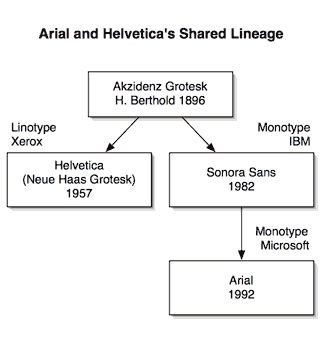
As Rod tells it, the “Story Behind the Story” is a little more nuanced; he traces the origins of both Helvetica and Arial to Berthold’s Akzindenz Grotesk of 1896. In those days, the grotesks were considered a novelty typeface. Stripped of their familiar serifs, any grotesk face was seen as truly ‘grotesque.’

It’s no accident that Helvetica’s original name was “Neue Haas Grotesk”—in fact, Helvetica’s lineage can be traced directly back to Akzidenz Grotesk. The Haas foundry was purchased by Linotype, and Linotype subsequently licensed Helvetica to Xerox in the early 1980’s for use as a computer display font.
Around the time that Xerox started using Helvetica, IBM created a specification for a typeface that was metrically identical to Helvetica, and the job went to Monotype. Longtime Monotype designer Robin Nicholas created “Sonora Sans.” And in 1992, when Microsoft wanted a replacement to its display Helvetica (Linotype sued M$, and won) for Windows 3.0, Monotype licensed “Arial,” a renamed Sonora Sans.
By the way, if you’re interested in going ‘back to the source,’ Rod is putting the finishing touches on a modernized version of Monotype Grotesk from 1926, soon to be available from Monotype.