It’s been a long time since my last post in September. My full-year sabbatical leave was intended to conclude the physical computing work with the Media Circus book and an exhibition. Usually a sabbatical is intended to reinvigorate one’s practice, but to tell the truth, when “The Technology of Good Intentions” concluded, I was exhausted. I carefully boxed-up the work and placed it in storage, and took a break, which in this case was to return to my role as Design Chair at NSCAD. The big job was to co-author a divisional self-study with my good friend and colleague Rudi Meyer. Design programs at NSCAD had been completely revised since our last review in 2003. We had a new pedagogy called “Interdisciplinary Design”, new faculty, a revised Bachelor of Design Major in Interdisciplinary Design, a new Master of Design, and a new Post-Baccalaureate Certificate in Design that acts as a bridge for international students between their design undergraduate degrees and the NSCAD MDES. So there was lots of work to do to record all that. We delivered the self-study in January — happily on time and “under budget”.
Around this time I started noticing that I was having dreams of drawing and painting. I tend to remember most of my dreams, and I’m able to make a mental note if I get ‘reruns’. I don’t remember the pictures, only the fact that I was drawing and painting, and the imagery came out of me without much effort. So for me, the transition from sleep dreaming to day dreaming was easy and natural.
I wasn’t always a ‘designer’
I should back up a bit: Drawing was my first love. I was a Fine Art Major at the University of Guelph and graduated with my MFA from York University in 1980. My Master’s exhibition was one of a very few at that time held in a commercial gallery: Gadatsy Gallery on Yorkville Avenue specialized in artists who draw. I was part of the Gadatsy stable of artists until around 1985, when they moved to Port Dover, and I gave up my studio in Guelph and hung up the pencils for interaction design using computers.
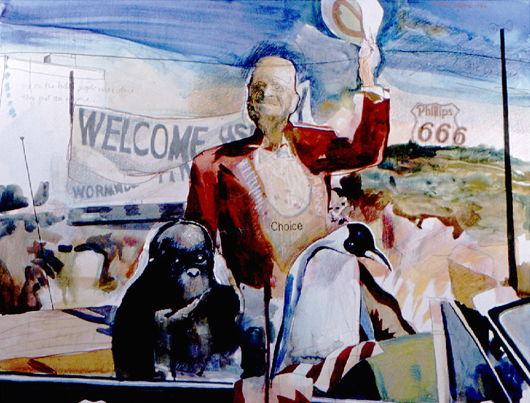
For the next ten years, I focussed on design, but at the end of that period I bought a software program called “Painter”, a pressure-sensitive drawing tablet made by a company called WACOM, and did a series of work that I showed at the Anna Leonowens Gallery in 1994. Shortly afterward that show, I put the work away; I felt frustrated by three factors:
- computer speed (which related directly to image size): the larger the image, the slower the computer became, and responses lagged to such an extent that there was little relation between what I was asking the computer to do and what actually got done.
- output size: the best prints available at that time used dye-sublimation: not bad in terms of colour fidelity, but the paper was shiny and limited in size to around 18 x 28 inches.
- “arms-length’ relationship between the graphics tablet and the computer screen: the tablet was a separate device from the monitor. Although the marks that the pressure-sensitive stylus made were accurately mapped onto the display, it’s unnatural to the human mind and resulted in ham-fisted attempts at truly ‘freehand’ drawing.
Whenever I thought about actually going back to making images, I needed to resolve the three above issues and I had to have the desire to work with ideas in picture form once again.
Choosing a tablet
Nothing could happen until I committed to acquiring a proper input device that would allow me to draw directly on the image. WACOM has been making creative pen displays for several years, and tend to be very expensive. The professional 22′ Cintiq goes for around $2500. The 13′ Cintiq was not quite so expensive at $1000. I also read Frenden’s online review of the Chinese-made Monoprice tablet; Frenden is unimpressed by the Cintiq and considers WACOM’s products to be overpriced underperformers. When I was in China in February, I looked into ordering a Monoprice tablet on Taobao with the help of a Chinese friend, but I concluded that the risk of buying in China (and not being able to return it if there was a problem — yes, I do learn from experience, sometimes) was not worth the couple of hundred dollars I would save in HST and shipping. Frenden’s ink work leads him to place emphasis on pressure sensitivity over display quality, while in my work I place priority on having good colour fidelity. In the end, I decided that I was happy with the previous two WACOM tablets I’ve owned, and placed an order through Amazon for a Wacom Cintiq 13HD Interactive Pen Display.
I’ve had it for a couple of weeks and I have to say that my only disappointment is that the display isn’t as bright as my iMac monitor: it isn’t usable in bright light. We have nice translucent blinds in our office, so it’s not a problem. It’s taken quite a while to get used to the new setup: the Cintiq replaces my second monitor which was located to the right of the iMac screen, while the Cintiq is positioned under the main Mac screen. I’ve moved the dock from the left to the bottom, which takes some getting used to. I’m also re-learning Corel Painter, which in its X3 version is about 6 versions past when I last used it.
I’ve adopted the Michelle Papadopoulos’ “white glove” technique for allowing the hand to slide easily over the surface of the tablet display, and I’m still experimenting with which angle to use; the first week I was using the highest angle, which seemed to cause my hand to cramp up. I changed to the middle angle a couple of days ago and that seems to be more comfortable during longer drawing sessions.
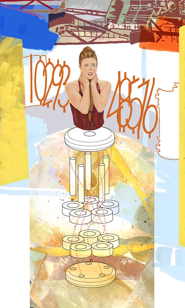
The drawing at the top of the post is “Mid-Point Peg”, at ‘golden beta’, so to speak. Size is 32.5 x 54.2 cm (12.8 x 21.3 in.). In terms of pixel dimensions, it’s 1920 x 3200 px at 150 dpi. I’m letting it sit and steep a while to see if anything comes up before I sign it and move on to the next one.