Category Archives: design

Eric Aldwinckle

Eric Aldwinckle Holding Forth

For the past six years I’ve been working on a biography of Canadian War Artist and designer Eric Aldwinckle. Around 1976, my high school friend Timothy Sullivan had been taking music composition lessons from Eric’s friend Harry Somers. Harry introduced Eric to Tim, and he introduced me to Eric. I was going into my third year at the University of Guelph as a Fine Art major.

My first meeting with Eric was with Timothy and my other two friends from high school, James A.J. Smith and Jim Carwana. His St. Jamestown (Toronto) apartment was cluttered, stuffy and could have used a good scrubbing. He offered us out of his meagre stocks a combination of Coke and beer, which he called “black velvet”. It wasn’t very good, but the conversation, as it often was with the four of us, was deep and intense. Eric loved it, but I remember him berating Jim Carwana for something, and as a result Jim did not return for later meetings.

I returned several times that summer, and exchanged almost a score of letters with Eric. One day, I was in Toronto and called him out of the blue. He answered, “Hello Michael.” Needless to say, in those days before caller id, I was nonplussed.

In one letter, I asked him if he could send me some biographical material. I had done a library search, and there was nothing available about Eric’s work. I thought that one day I might like to write something about him. He was flattered, and his reply was negative, but it was made with the skill and affection that is all Eric:

About me not telling you all, when Tim asked if he could bring you to meet me I did not dream that you expected me to boast of my accomplishments over the last fifty years. Sorry. Also I wilted when in your September letter you asked if I would give a condensed biography and memoirs for your and Tim’s benefit because you visualized my last breath at any moment. It is asking too much. I can give you just the latest “bits”… So… when you are older and I am amusing myself on a damp cloud strumming my little lyre you can do research all filed and ready to order.

Years later, I had forgotten about the question I asked, only to be reminded of it after I had started this project, when I found the only letter from him that I kept.

The book is in draft form with the NSCAD University Press and has expanded to include as a collaborator Brian Donnelly of Sheridan Institute of Technology and Advanced Learning. A new website, that includes some material omitted from the book, has just been launched at ericaldwinckle.info.
Return for Regrooving

I am employed as a design professor at NSCAD, a small visual arts university in Halifax, a city that hangs off the edge of eastern North America. The global economic downturn has disrupted, to say the least, many of our dreams and aspirations. In education, this means that belts need to tighten because some schools were using stock market investment income to cover operating budgets. NSCAD University, as a public institution that had not kept up with endowment giving, did not fall into this trap. Our problem is that the construction (and shortcuts taken at that time) of the Port Campus several years ago has resulted in a serious budget shortfall.

In April, our President, David P. Smith, established an ad hoc “task force” to look at ways the university could save money with as little impact as possible upon the student experience. I sat in the meetings and while many of the suggestions brought forward were good, and everyone understands the profound difficulties facing us, I could not help but wonder if how different our discussions would be if, instead of try to patch a system that has been running for 122 years (with all its patches, grafts and compromises), we were given a budget and a mandate to start fresh and build a school from scratch?

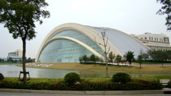
Shanghai Institute of Visual ArtsLast October, during my swing through China to promote NSCAD and our Master of Design program, I visited the Shanghai Institute of Visual Arts (SIVA), with the help of a recent MDes graduate, Feichen Wong. SIVA is a new university affiliated with Fudan University, one of China’s top ten schools. To establish the school, the central government gave Fudan about 60 million dollars for capital infrastructure. The result is three postmodern buildings in suburban Shanghai’s University Park. I met with Zhuang Liang Xiao, Executive Vice-President and Zhang Tong, Dean of School of Spatial and Industrial Design.
Prof. Zhang told me that he enjoyed having the opportunity to re-envision a new school; they tried to design the institution with fresh eyes and with a knowledge that graduates will be faced with 21st century challenges. SIVA is organized into a number of Colleges, Academies, Departments and Institutes: the College of Communication Design, a Digital Media Institute, the College of Space and Industrial Design, the Fashion Institute of Design, the Academy of Fine Arts, the Departments of Performing Arts and Fine Art, a Graphic Information Center, and a Management Training Center. I was not able to determine why one area was an “Institute” and the other an “Academy.”

I left SIVA with a sense of envy, and it made me wonder what it would be like to be given a blank sheet of paper: could I do better? Granted, it’s one thing to rebuild with a $60 million cheque in your pocket, compared to owing a million or more. And I do not for a moment think that the money given to my Chinese collegues is in any way unencumbered; I am not sure which is better, to be rich yet loaded down by thousands of years of educational practice that merits copying over originality, or as NSCAD is, impoverished yet embued with a tradition of spirit of creative optimism—perhaps NSCAD is better off in the long run?

Arial and Helvetica: A Grotesk History

arial_92

In March I attended the AGM of the Graphic Designers of Canada (Atlantic Chapter). I’m not a dues-paying member; I was asked to help out with the meeting because it was being held at NSCAD University and I was the only Design faculty who could be there. The main event was a talk by the noteworthy type designer (and good friend) Rod McDonald, who gave a talk called “Arial, The Story Behind the Story.”

By now pretty much every working graphic designer has seen “Helvetica: The Movie,” and is familiar with the canard that “Arial is a bad copy of Helvetica.” This idea is quite prevalent, and as Rod says, is “perpetrated by people who really should know better.”

The “story” behind Arial is that Microsoft did not want to pay Linotype the licensing fee for Helvetica, so they produced a copy and called it “Arial.” The tale has gained traction because:

  1. graphic designers are predominantly Apple users and have no allegiance to the beast of Redmond and
  2. it fits well with the public image of Microsoft as a collection of late 20th-century robber-barons

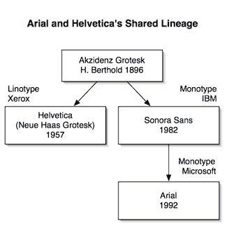
As Rod tells it, the “Story Behind the Story” is a little more nuanced; he traces the origins of both Helvetica and Arial to Berthold’s Akzindenz Grotesk of 1896. In those days, the grotesks were considered a novelty typeface. Stripped of their familiar serifs, any grotesk face was seen as truly ‘grotesque.’

Origins of Helvetica and Arial

It’s no accident that Helvetica’s original name was “Neue Haas Grotesk”—in fact, Helvetica’s lineage can be traced directly back to Akzidenz Grotesk. The Haas foundry was purchased by Linotype, and Linotype subsequently licensed Helvetica to Xerox in the early 1980’s for use as a computer display font.

Around the time that Xerox started using Helvetica, IBM created a specification for a typeface that was metrically identical to Helvetica, and the job went to Monotype. Longtime Monotype designer Robin Nicholas created “Sonora Sans.” And in 1992, when Microsoft wanted a replacement to its display Helvetica (Linotype sued M$, and won) for Windows 3.0, Monotype licensed “Arial,” a renamed Sonora Sans.

By the way, if you’re interested in going ‘back to the source,’ Rod is putting the finishing touches on a modernized version of Monotype Grotesk from 1926, soon to be available from Monotype.